Data Viz
A Guide for Grown-Ups
REFERENCES
https://datavizcatalogue.com/
https://datavizproject.com/data-type
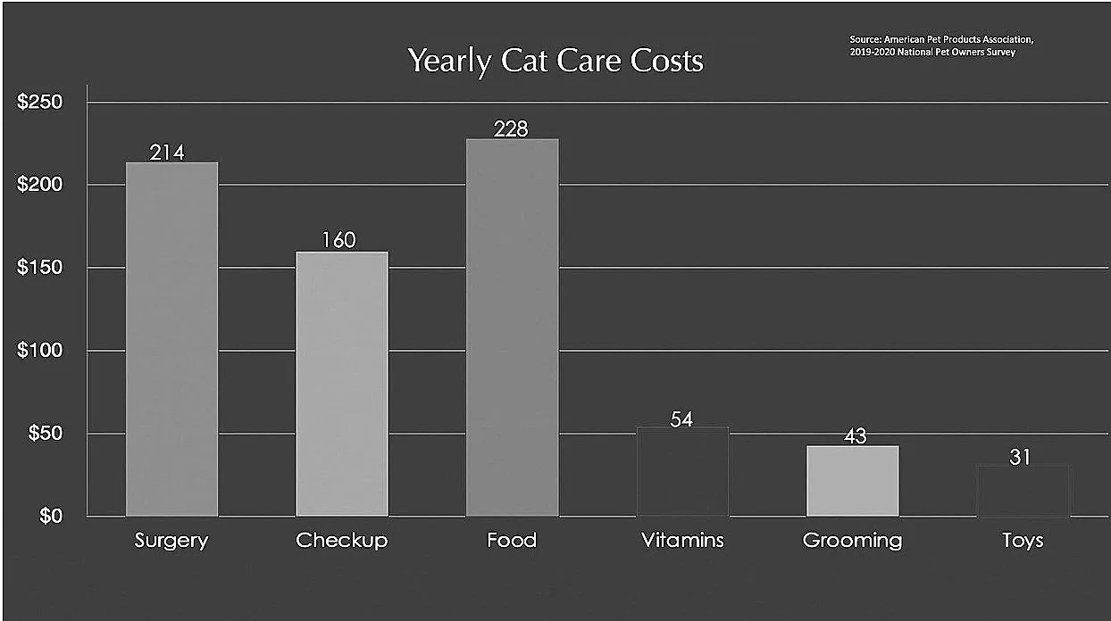
Bar graph
A bar graph, or bar chart, uses rectangular bars to compare data values across categories or time.
One axis shows the categories
being compared, and the other
axis represents a value scale. The
bars may be horizontal or vertical; their length is proportional to the value they represent.
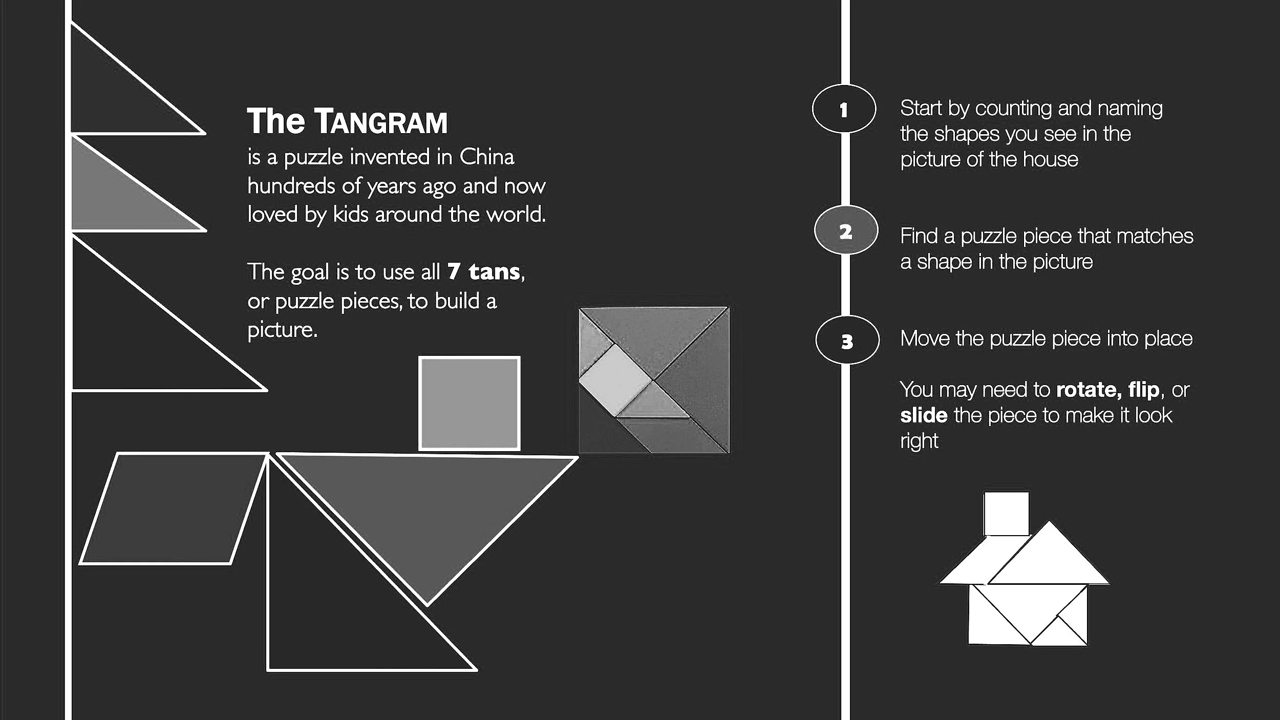
How-to infographic
A how-to infographic pictures, color, numbers, and words to explain how to make or do something. It often includes a
series of numbered steps.
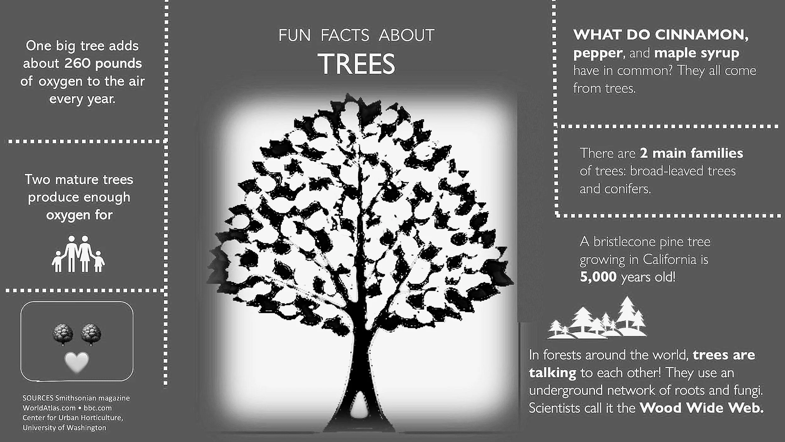
Informational infographic
An informational infographic uses pictures, color, numbers, and words to grab your attention and communicate information clearly and quickly.
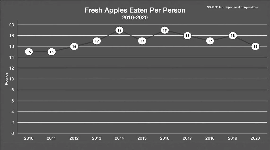
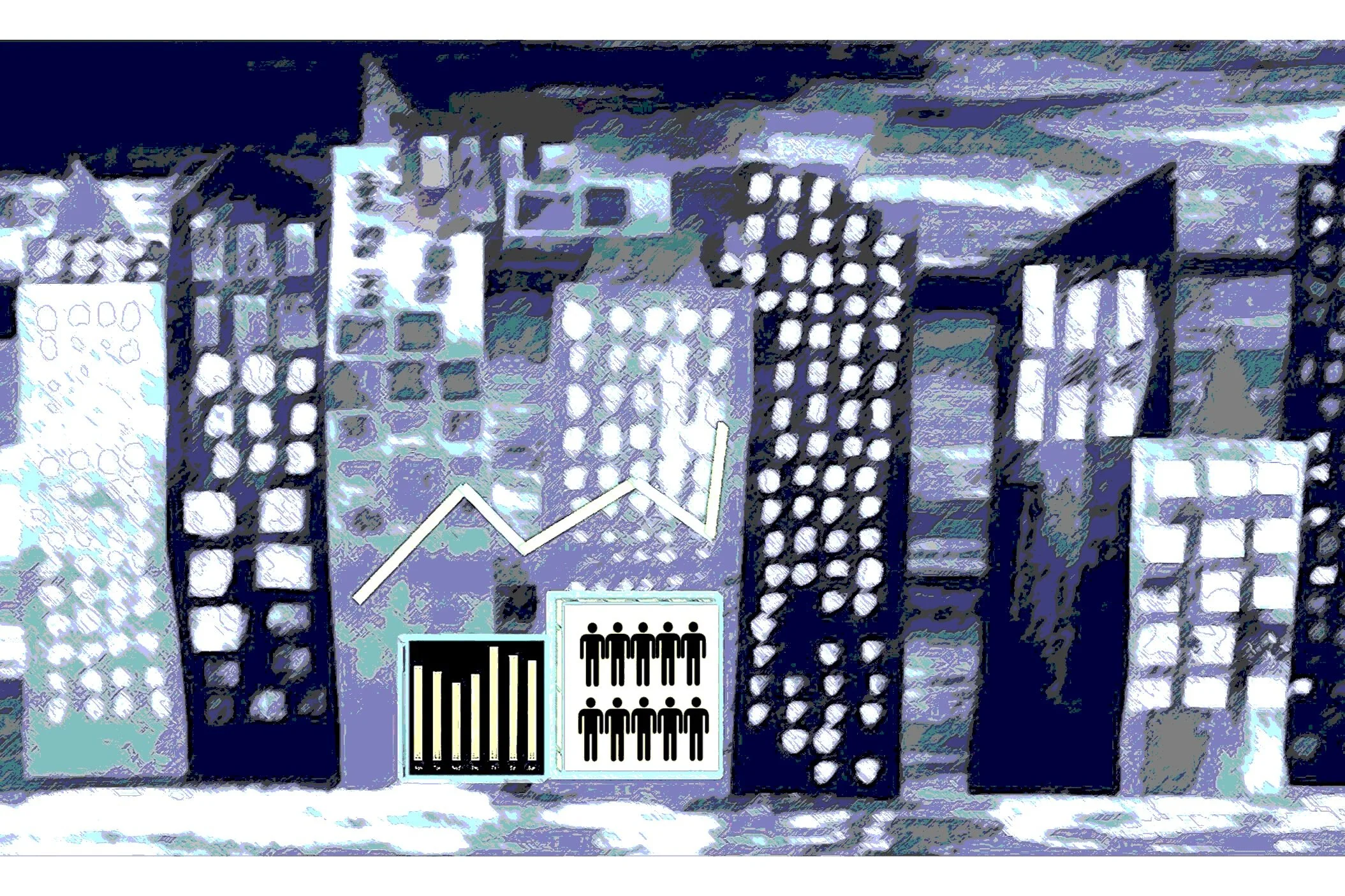
Line graph
A line graph captures data points over time and connects them with lines. The
y-axis typically has a quantitative value and the x-axis is a timescale divided into equal intervals. The slope of the line makes it easy to see patterns and trends, and thereby make predictions about the future.
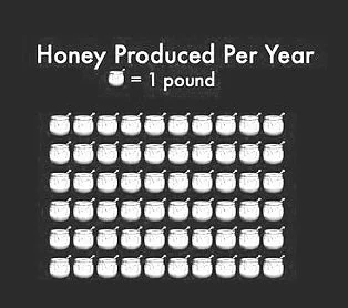
Pictograph
A pictograph, or pictogram, uses icons, pictures, or symbols to represent data values. Repeated icons are often arranged in a line or grid called an array, with each icon representing a number of units, usually 1, 10, or 100.
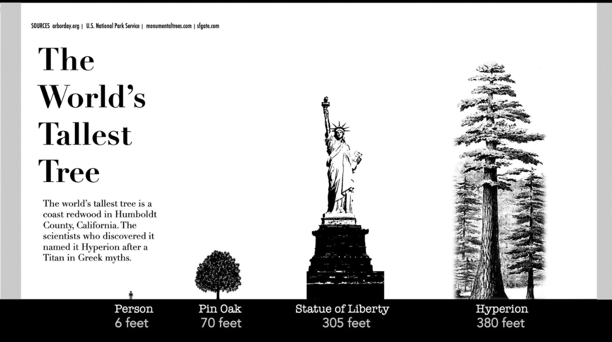
Pictorial chart
A pictorial chart uses illustrations to show how things compare in size or value. Pictorial charts make it easy to visualize data because you can see, side by side, what is being compared.
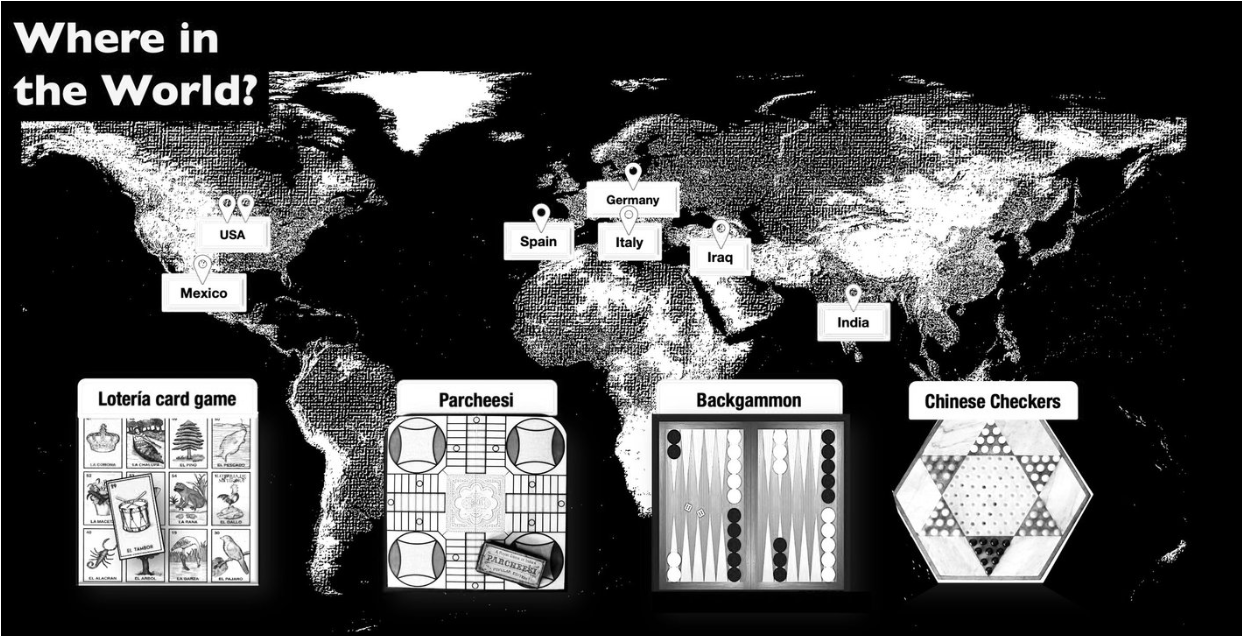
Pin map
A pin map is a map that uses words, colors, and pictures to provide information about different places. A pin icon identifies the location of key places on the map.
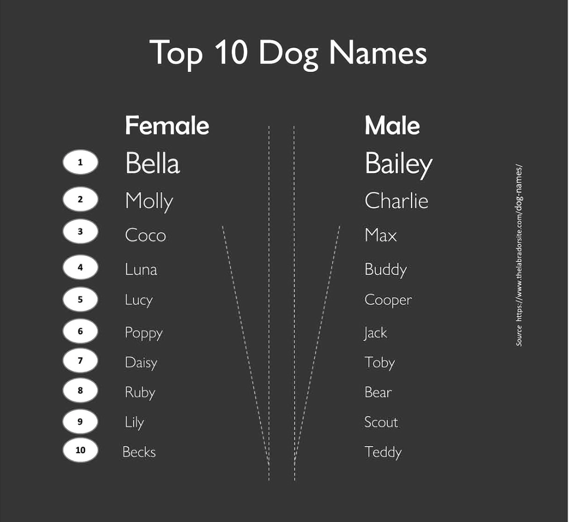
Ranked list
A ranked list arranges items in a category according to a rating system or performance record. It is often designed as a numbered list, with the highest rated item at the top labeled number 1.
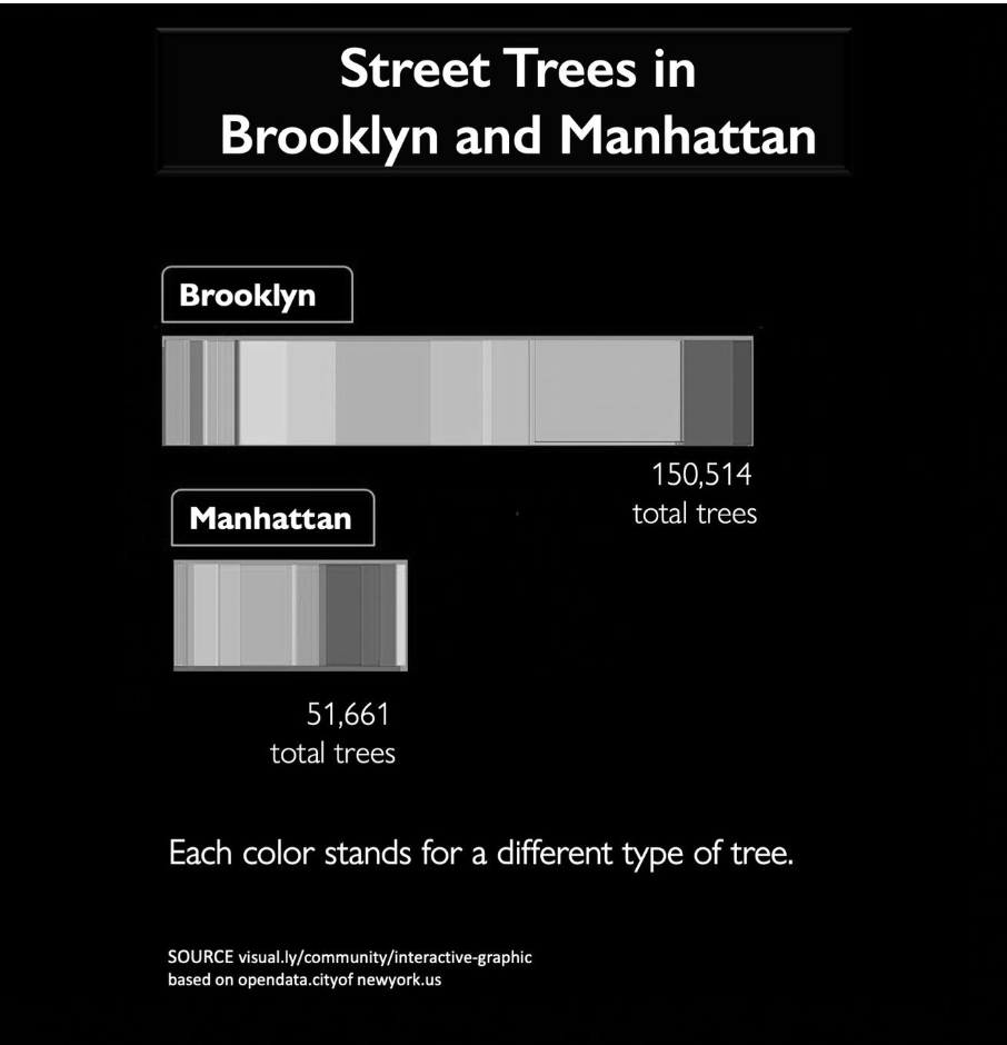
Stacked bar chart
Stacked bar charts, also known as segmented bar charts, use segmented bars to show how a larger category is divided into smaller categories. The size of the segment reveals the relationship of the subcategory to the total amount.
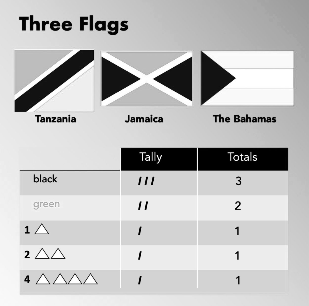
Tally chart
Also known as a frequency table, a tally chart uses tally marks in sets of 5 to count and record how often (frequency) or how widely (distribution) something occurs. The first column lists the categories or values. Each time one occurs, a tally mark is added to the second column. At the end of the data collection process, the tally marks for each category are added up and the numeric total is recorded in the last column.
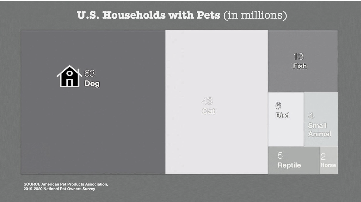
Treemap
A treemap uses nested rectangles and number values to show a hierarchy of part-to-whole relationships. The area of each rectangle is proportional to the quantity assigned to that category.