VIZOLOGY 101
Navigation Tips
Navigation Tips
BAR GRAPH

STEP 1
Read the title to get an idea of what the graph is about. Find the source to see where the data come from.
Is a survey of pet owners a good source of information about how much people spend on cat care each year?
A yes
B no
C maybe

STEP 2
Look at the design, starting with the x-axis. That’s the line that runs from left to right at the bottom of the graph. There are six color bars along this axis. Read the labels to discover which costs are being compared.

STEP 3
Look at the y-axis. That’s the line that runs up and down the left side. It starts at zero dollars and goes up to $250. Each step up this value scale equals $50. The taller the bar, the higher the cost.

TAKE A CLOSER LOOK
How much do cat owners spend each year on checkups at the vet?
A $160
B $54
C $228
Check your answer . . .
Find the bar labeled Checkup and imagine tracing a line from the top of the bar to the y-axis. It intersects just above $150. The exact cost is shown at the top of the green bar: $160.
BE VIZ SMART ✺
Whenever you read a bar graph, look to see if the scale starts at zero. If it doesn’t, watch out!
Graphs that don’t have a zero baseline can make small differences in value look bigger and more important than they really are.
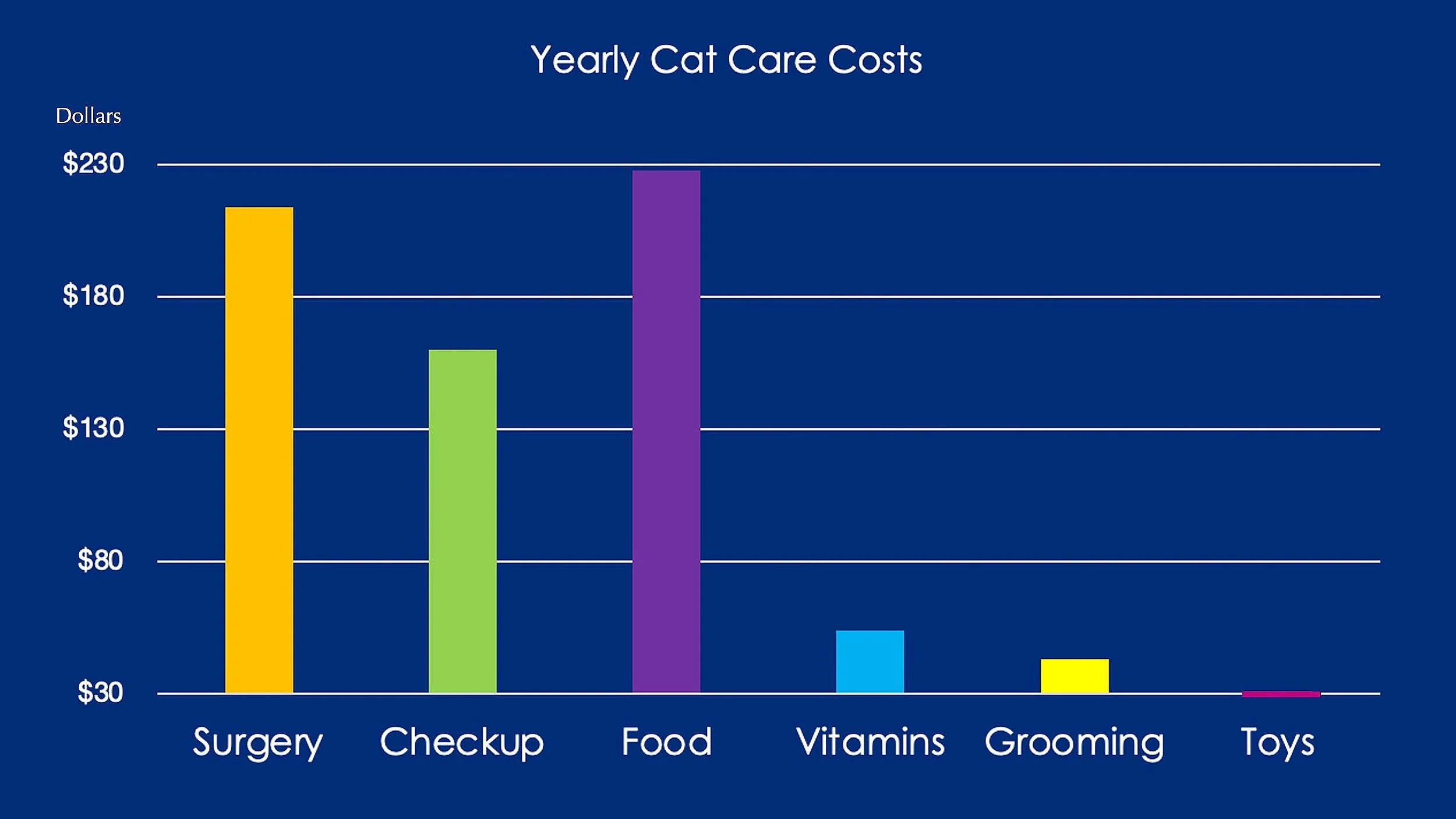
1 What baseline does this graph use?
A $0
B $30
C $230
2. How does the baseline affect the graph?
A It leaves out important information
B It makes the top costs look much higher
C It increases the number of dollars spent